Do you want to know why your business needs a responsive website? You have come to the right place!
Imagine you are browsing the web through your phone. Then you go to a website where you cannot view text and images. An image is misplaced, and you must pinch and zoom to read something.
This is very frustrating, I am sure you’ll agree. That is what happens when you are lacking responsive website.
Today, in the digital world where people browse on different devices, a responsive website is no longer a luxury, but a necessity.
A responsive website ensures that the user has a seamless experience, improves your SEO rankings, and ultimately leads to increased conversions.
Let’s dive into why responsive design matters and some essential tips for your next website design.
What is a responsive website?
A responsive website is set to give an optimal viewing experience that will accommodate a wide range of devices.
To be more specific, it will automatically adjust the layout, images, and content of the website according to the device’s screen size through which one is navigating the site.
Why is a Responsive Website Important?
- Better User Experience: A responsive website easily adapts and responds to several screen sizes which ensures smooth and readable navigation in the site by the users.
- Enhanced SEO Rankings: Google favors search results with more mobile-friendly content. A well-designed responsive reduces bounce rates by improving page loading speed and all other SEO values.
- Cost-Efficient Maintenance: Managing one responsive website is more economical than keeping two separate desktop and mobile versions. It is easier to update and manage the content.
- Higher Conversion and Sales: The chance that users will finish desired actions like making a purchase or signing up for a service increases when it is easy across devices.
- Increasing Mobile Traffic: With mobile users outnumbering desktop users, businesses need to be able to cater to this audience. A responsive website ensures accessibility and engagement for mobile visitors.
Importance of Responsive Website: Tips for Your Next Design
Choose a Fully Responsive WordPress Theme

A good foundation for responsiveness is in choosing the theme properly.
How to Select the Best Theme:
- Look for “mobile-friendly” or “fully responsive” labels in the theme description
- Themes that automatically adjust to different screen sizes
- Google’s Mobile-Friendly Test Responsiveness
- Chose light themes that work fast: these are
- Shop Mania is a versatile and user-friendly WordPress theme designed for eCommerce sites.
- Open Shop is a modern and responsive website wordpress theme designed for online stores.
- Astra is fast and highly customizable.
- OceanWP has many features and has built-in mobile optimization.
- GeneratePress is minimalist yet powerful for speed.
✅ Pro Tip: If you already have a theme and want to test its responsiveness, resize your browser window and see if the layout adjusts.
Employ Mobile-First Design Strategy
You design with a mobile-first approach and then spread it to broader screens.
Key Features of a Mobile First Strategy
- Keep navigation lean and easy.
- Prioritize Fast Loading Elements/avoid too many animations Make only the very important content stand out on a smaller screen, and employ progressive enhancement technique, where functionality loads on devices that can use it.
✅ Pro Tip: Begin designing on a mobile screen and then scale up for tablets and desktops.
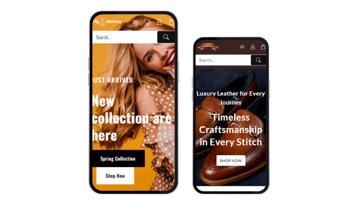
Optimize Images and Media for Responsiveness

Images are an essential aspect of a site, but they are one of the slowest components in page speed.
Best Practices for Responsive Images:
- Utilize CSS media queries to allow images to respond accordingly.
- Make use of vector-based formats such as SVGs for logos and icons.
- Optimize images in WebP format to improve load time.
- Utilize lazy loading via WP Rocket, Smush, or Lazy Load by WP Rocket.
✅ Recommended Plugins:
Smush: compresses images without loss of quality.
ShortPixel: Converts images to WebP format.
Imagify: This reduces the file size while retaining high resolution.
Use a Fluid and Flexible Grid Layout
A responsive website layout should adapt to different screen sizes.
How to Achieve a Fluid Layout:
- Use CSS Grid or Flexbox instead of fixed-width designs.
- Avoid using fixed pixel widths; instead, use percentages (%) or viewport units (vw, vh).
- Utilize frameworks like Bootstrap or Tailwind CSS for grid-based responsive designs.
✅ Pro Tip: Test different screen sizes by resizing your browser or using Chrome DevTools (Inspect Element > Toggle Device Toolbar).
Make Typography Responsive & Readable
The text must be readable on any device.
Scalable Typography Best Practices:
- Set a line height to at least 1.5 to be better readable
- Do not make fonts too small: the minimum is body text 16px.
Implement a Mobile-Friendly Navigation System

Navigation should be easy to use on small screens.
Best Practices for Mobile Navigation:
- Use a hamburger menu (hidden menu for mobile users).
- Keep navigation concise (no more than 5-7 main menu items).
- Add a sticky header for easy access to the menu.
- Use tap-friendly buttons (minimum size: 44x44px).
✅ Recommended Plugins:
Themehunk Mega Menu – Responsive Menu
Max Mega Menu – Responsive menu customization.
WP Mobile Menu – Adds a sliding menu for mobile users.
Optimize for Touch Interactions
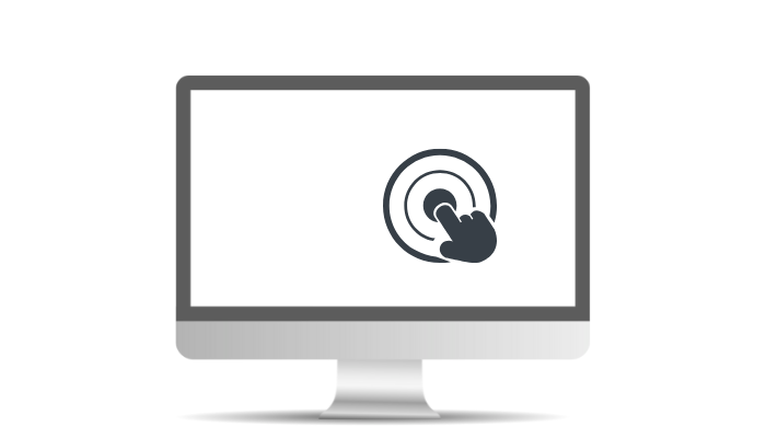
Mobile users interact with websites using touch gestures.
- Best Practices for Touch Optimization
- Increase button size to at least 44×44 pixels.
- Ensure proper spacing between clickable elements
- Avoid hover-based interactions. These do not work well on touchscreens
✅ Pro Tip: Focus on CSS for rich touch interactions.
Use Only Responsive WordPress Plugins
When developing your wordPress website, choosing responsive plugins is crucial to providing a smooth experience on all devices.
Not all WordPress plugins are responsive.
What to Look for in a Plugin:
- Mobile-friendly.
- Does not affect your website’s speed.
- Updated by the developer regularly.
✅ Recommended Responsive Plugins:
- Elementor – Drag-and-drop page builder with mobile editing.
- Lead Form Builder Pro – Elemento Addons for Elementor is a WordPress plugin, which provides premium extensions and elements to extend the features of Elementor.
- TH All in One Woo Cart – This plugin will add a floating cart to your website. Customers can update or remove products from the cart without reloading the cart continuously.
- Elemento Addons – Elemento Addons for Elementor is a WordPress plugin providing premium extensions and elements to extend the features of Elementor.
- WPForms – Contact forms are optimized for mobile devices.
- WP Rocket – Page caching is done on mobile devices.
Speed Up Pages for Mobile Users

In today’s digital fast-paced world, making sure your website loads fast for mobile users is important for user experience, engagement, and conversion rates.
Page speed is important to the user experience, and consequently, SEO.
Ways to Make it Faster:
- WordPress Rocket and W3 Total Cache caching.
- Compress CSS, JS, and HTML using Autoptimize.
- Enable Gzip compression through .htaccess.
- Use a CDN (Cloudflare, BunnyCDN).
✅ Pro Tip: Analyze your mobile performance with Google PageSpeed Insights.
Test Your Website Across Multiple Devices
Cross-device testing of your website is important in the modern multi-screen digital world where users consume content on different screen sizes, resolutions, and operating systems.
After implementing responsive design, testing is the way to go.
Best Testing Tools:
- Google Chrome DevTools (Inspect Element > Toggle Device Toolbar).
- Responsinator – Tests responsiveness on different screen sizes.
- BrowserStack – Allows real-device testing.
✅ Pro Tip: Test on real mobile devices instead of just using online simulators.
Key Benefits of a Responsive Website
- Improved User Experience: Seamless navigation across all devices enhances user satisfaction.
- Enhanced SEO Performance: Responsive sites rank higher on search engines.
- Increased Conversion Rates: Easy access increases the chances of user conversion.
- Faster Loading Times: Optimized resources lead to quicker page loads.
- Cost Effectiveness: One site reduces maintenance time and costs.
- Adaptability to Future Devices: Works well on new devices and screen sizes.
- Reduced Bounce Rate: Users stay longer due to easy accessibility of content.
- Easier Analytics Tracking: Simplified data collection with a single URL.
- Increased Social Sharing: Better usability encourages content sharing.
- Better Brand Consistency: Uniform design across all devices builds trust.
Common Mistakes to Avoid in Responsive Web Design
1. Fixed Width Layouts
- Don’t: Fixed pixel widths.
- Do: Percentage-based widths will be more flexible.
2. Mobile Optimization Omission
- Don’t: Desktop only design.
- Do: Design mobile-first.
3. Overlooking Touch Targets
- Don’t: Small buttons and links.
- Do: Ensure interactive elements are at least 44×44 pixels.
4. Overuse of Media Queries
- Don’t: Too many media queries.
- Do: Fluid grids and breakpoints should be used judiciously, only when necessary.
5. Not Testing on Different Devices
- Don’t: Inconsistent user experiences.
- Do: Test on real devices as well as emulators.
6. Poor Management of Images
- Don’t: Image files that have a large dimension and slow loading.
- Do: Use responsive images.
7. Missing Flexbox/ Grid Layout
- Don’t: Complicated design.
- Do: Use CSS flexbox or Grid for flexibility
8. Overloading with Contents
- Do not do: Cluttered designs
- Do: Limit content on the necessary aspects of each device.
How we can help?

Justech Creations can help by providing comprehensive web development services tailored to your business needs. They are among the popular web development companies.
With expertise in WordPress, PHP, JavaScript, MySQL, and React, we create dynamic and efficient websites.
Their solutions are cost-effective and offer personalized support to promptly address any challenges.
Whether you require a custom website, an application, or assistance with WordPress themes, our experienced team is committed to helping businesses grow and succeed online..
Key offerings include:
- Web Development & Design
- WordPress Development
- Plugins Development
FAQ
Q: How can I make images responsive?
Ans: To make images responsive, use CSS properties such as max-width: 100%; and height: auto;. This allows images to scale within their container while maintaining their aspect ratio.
Q: How can I optimize CSS for responsive design?
Ans: To optimize CSS for responsive design, consider the following techniques:
1. Combine and minify CSS files to reduce load times.
2. Avoid excessive use of media queries; group similar queries together.
3. Use shorthand properties where possible to reduce the CSS footprint.
4. Remove unused CSS
Conclusion
A responsive design is important for improved SEO rankings, better performance, and increased user engagement.
By incorporating best practices such as flexible layouts, media queries, and mobile-first approaches, you can create a seamless experience that caters to the needs of all users.
If you have any questions regarding anything, do not hesitate just to comment below, and we will help you solve your problem.
Do Follow us on Instagram and Linkedin.
Discover more Articles: