
Your website’s color palette is one thing more than just an aesthetic decision; it is a strategic one.
Colors define the visual identity and can be proven to profoundly influence the user’s behaviours, evoke specific emotions, and even drive some conversions.
Understanding the well-established psychological effects of color can give you a significant advantage in web design.
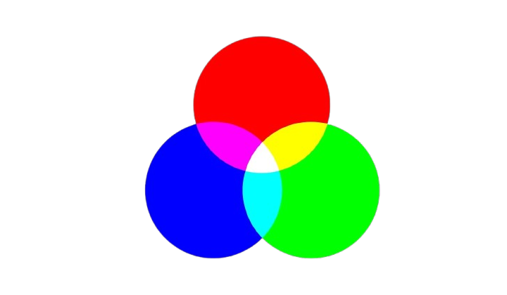
First, it’s important to understand color theory and the basics of color combinations. Colors can be grouped into primary, secondary, and tertiary, and they can work together in different ways, like complementary or similar colors.
Familiarizing yourself with these concepts will help you see how colors interact and complement each other, paving the way for a balanced and cohesive design.
We’ll explore how to apply these principles practically, ensuring that your color choices enhance your website rather than detract from it.
In this guide, we’ll look at how to pick the best color palette for your website, with examples and helpful tips.
Why is Choosing the Right Color Palette Important?
Color palette selection for a website is a critical element that defines how a user will perceive and experience a website.
Colors significantly relate to:
1. Brand Recognition: Color makes your brand memorable. As an example, the redness of Coca-Cola and the yellowish-golden arches of McDonald’s are readily recalled.
2. User Experience: A harmonious color scheme will help make your site user-friendly and also aesthetically pleasing.
3. Emotional Connection: Different colors evoke different emotions. Blue conveys trust, while yellow radiates energy and happiness.
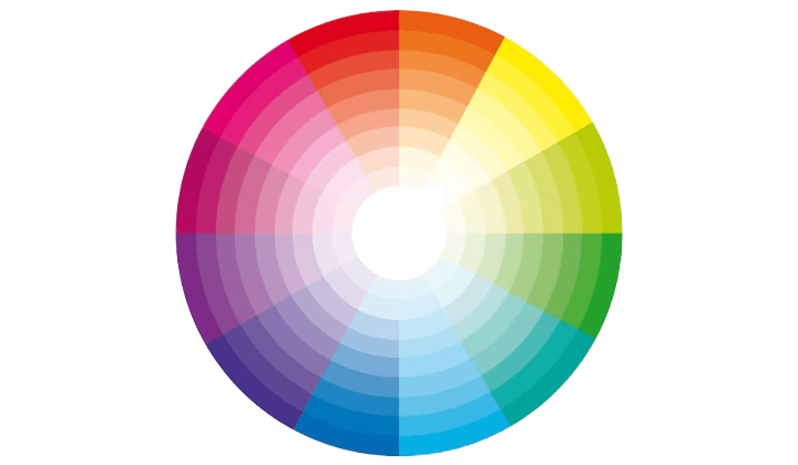
Using Color Theory to Choose Colors
Color theory helps you pick colors that harmonize and enhance your website’s design. The color wheel shows how primary, secondary, and tertiary colors relate. Techniques like:
- Complementary Colors: Opposite on the wheel, creating contrast (e.g., blue and orange).
- Analogous Colors: Next to each other, offering a cohesive look (e.g., green, blue-green, and blue).
- Triadic Schemes: Three evenly spaced colors for balance and vibrancy (e.g., red, yellow, and blue).
Using color theory ensures your site is visually appealing, readable, and emotionally engaging while reflecting your brand identity.
Using Color Psychology to Choose Colors

Color psychology helps you choose colors based on the feelings and actions they inspire. For example:
- Red: Creates urgency or excitement (good for sales or buttons).
- Blue: Builds trust and calmness (great for professional brands).
- Yellow: Spreads happiness and energy.
- Green: Symbolizes nature, health, and growth.
- Black: Feels elegant and luxurious.
Choosing the right colors helps connect your audience and support your brand’s message.
How to choose a color palette for a website
Define Your Brand Identity

Your website’s colors should match your brand’s personality and values. Start by asking yourself:
- What is the purpose of your brand?
- Who are you trying to reach?
- What are your key values?
Example: A brand for young creatives might go for bold and vibrant colors to showcase energy and innovation. On the other hand, a law firm might choose neutral and professional tones to reflect trust and reliability.
Aligning your color palette with your brand identity ensures a consistent and meaningful connection with your audience.
Now that we’ve covered the basics of color theory and how colors affect emotions, it’s time to put that knowledge to work and create purposeful color palettes. A website might look nice with random colors, but without a strategy, it won’t do its job.
Here’s an easy 3-step process to pick the right colors for a website:

1. Choose a primary color
Choosing your primary color is the best place to start when building a color palette. This main color takes center stage and typically makes up about 60% of a website’s design, following the 60/30/10 rule.
When choosing a dominant primary color, consider two significant aspects: color psychology and context. Utilize color meanings to determine which hue best reflects the emotions you wish users to feel—calmness, excitement, freedom, or security.
And while you think about color psychology, don’t forget about context; overuse of common color associations without thought for the website could work against you.
Example: A yoga studio website might use soft lavender as the primary color to convey calmness and relaxation.
2. Choosing secondary colors
Once you’ve chosen a primary color, it’s time to pick one or more secondary colors. According to the 60/30/10 rule, secondary colors should make up around 30% of the website’s design. Start by deciding which color scheme suits the website best: monochromatic, complementary, or analogous.
Color psychology is important here too. Soft, muted tones create a calm and subtle vibe, while bold, vibrant shades bring energy and excitement.
Example, a monochromatic blue scheme can feel soothing, whereas a complementary blue and orange combination adds a playful, dynamic touch.
3. Choose an accent color

Finally, every color palette needs an accent color. This color is used sparingly, covering about 10% of the website.
It usually contrasts sharply with the primary color, making it stand out and drawing attention to key elements like buttons or call-to-action sections.
Example: For the same yoga studio, a golden yellow accent color can highlight call-to-action buttons or key sections like “Book a Class.”
Examples of Effective Website Color Palettes
Here are a few examples of website color palettes that effectively convey brand identity and create a great user experience:
Handyman

Hex Codes: #ec7525, #fcf3de, #61291b
The Handyman Services uses a striking color palette with orange, black, and white. The use of black results in sophistication and strength in the design, while orange brings warmth, enthusiasm, and energy.
Orange is used on the white background for buttons and key highlights to attract attention to the important elements of the site, making it visually attractive and user-friendly.
Olive oil
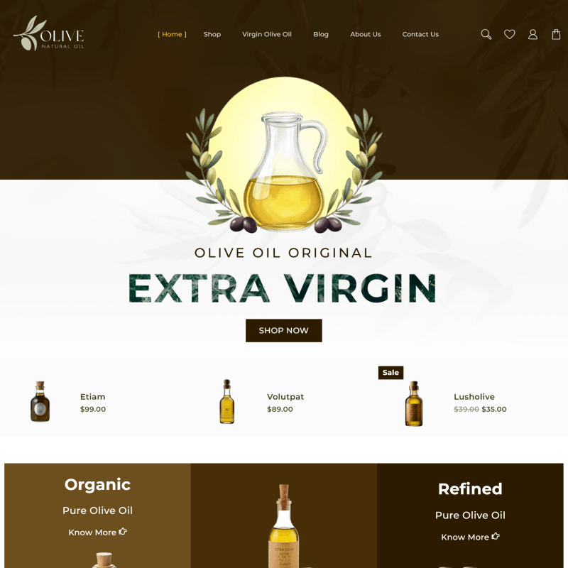
Hex Codes: #342209, #f3d73e, #0b3b2d
The Olive Oil demo uses a very natural and harmonious color palette that is green, white, and earthy tones. Green symbolizes health, freshness, and nature, perfect for an organic product-based website.
The clean white background keeps the design airy and elegant while giving room for the content to stand out effortlessly. Subtle earthy brown accents add warmth while reinforcing the organic theme.
This thoughtful palette aligns well with the brand’s natural essence, providing an excellent example of how to choose colors that reflect your product’s identity and values.
Amaze Mania
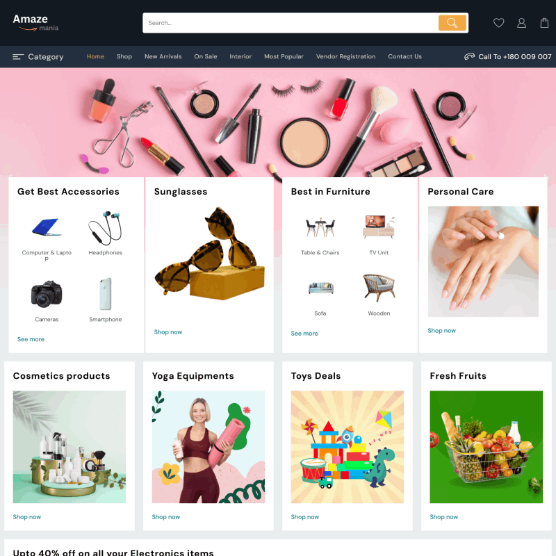
Hex Codes: #f8bccb, #232f3e, #ffffff
The Amaze Mania demo comes with a sophisticated color scheme in black, white, and pink. Black provides the foundation with modern strength, and white maintains a clean, airy feel.
Pink brings the pop of color, giving the contrast a playful feel, and grabbing the visitor’s attention. It exudes elegance with a touch of boldness, which is ideal for creative and trendy websites.
It’s a beautiful example of how a pop of color like pink can put energy and personality into minimalist designs.
Wall Mart

Hex Codes: #0071dc, #f0ae52, #45c3e1
The Walmart demo has a lively and balanced color scheme of blue, white, and orange. Blue is synonymous with trust and professionalism, so it is a good base color for an eCommerce platform.
The clean white background keeps the layout fresh and organized, and the content is easy to read. Orange adds warmth and energy to the design and highlights key elements such as call-to-action buttons and promotions.
This effectively guides attention to the right users and visually engages one to the effects of contrastive and yet complementary color in website designing.
Tips for Choosing the Right Color Palette

Know Your Brand
Choose colors that match the personality of your brand. Fun and energetic brands can use bright colors while neutral tones offer a more professional look.
Think About What Colors Mean
Colors evoke different emotions and feelings. Blue builds trust, while red encourages urgency. Green depicts growth and yellow induces happiness. When picking colors, use them based on the mood you want to set.
Keep It Simple
Having too many colors will distract your audience, therefore the number of colors should be limited. A good ratio to follow is using 60% of your primary color, along with 30% secondary colors, and 10% accent colors.
Make It Easy to Read
Always value accessibility by ensuring that there is a sufficient contrast to make reading easier for everyone, such as those with visual impairments.
Test Your Colors
Keep in mind that different screens and devices may portray your colors differently so it is paramount to check how your colors appear on different devices.
Use Online Tools
To make your work a lot easier, use Coolors or Adobe Color which specialize in picking out colors that work well together for you.
Highlight Important Parts
Always remember to highlight buttons, calls-to-action, and links to make them appear more attractive and easier for users to spot.
All in all, these tips will help you create a palette that will be appealing to the eyes but work for your website.
Common Mistakes to Avoid When Choosing Colors
- Too Many Colors – Limit the number of colors or stick to a few to support a clean look.
- Poor Contrast – Ensure the text and background combination is legible.
- Ignoring Accessibility – Consider issues related to color vision and opt for contrasting color combinations.
- Overusing Bright Colors – Keep the usage limited, or else, users will be overwhelmed.
- Ignoring Brand Identity – Select colors that speak about what your brand values.
- Clashing Colors – Practice caution; avoid the use of color combinations that just do not work.
- Ignoring Color Psychology – Color well! Make sure your color combinations support or incite the required emotions.
Bonus: Color Palette Tools & Resources
1. Coolors
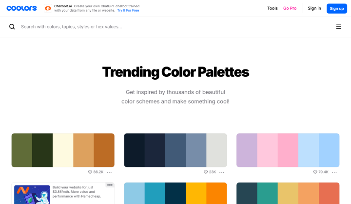
A user-friendly tool to generate color palettes quickly. You can explore trending color combinations and customize palettes for your website.
2. Adobe Color
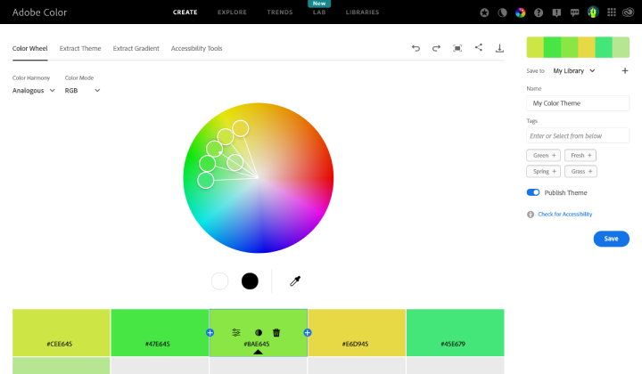
A powerful tool for creating color schemes. It offers color harmony rules and lets you explore palettes created by others.
3. Canva Color Palette Generator

Upload an image and let Canva generate a color palette based on the image’s colors. Great for pulling colors from visuals that already represent your brand.
These tools will help you choose and experiment with color palettes that fit your website’s style and functionality.
FAQ
Q: Why is selecting the right color palette critical in web design?
Ans: A well-optimized color palette enhances visual hierarchy, ensures seamless user interaction, and aligns with the website’s functional and branding objectives, improving user retention and conversion rates.
Q: What is the 60/30/10 rule?
Ans: This design rule allocates 60% to a primary color, 30% to secondary colors, and 10% to an accent color for a balanced and visually appealing layout.
Q: How does color psychology impact websites?
Ans: Colors influence user emotions and behaviors. For example, red evokes urgency, blue builds trust, and green conveys growth and balance.
Q: What are the common types of color schemes?
Ans: Popular schemes include monochromatic (variations of one color), complementary (contrasting colors), and analogous (neighboring colors on the wheel).
Conclusion:
Creating a perfect color palette isn’t only about making your website appealing and building a strong user experience that helps achieve your brand goals.
Knowing a basic background in color theory and psychology helps you design palettes that connect with the audience, invoke the right emotions, and enhance engagement.
Every color you choose, whether a staid monochrome design or an eye-catching complementing one, should capture the essence of your brand and appeal to your users.
As with any other brand, your brand is perceived through your website’s colors, so choose them carefully in such a manner that makes a lasting impression.
Explore More Articles: